Well folks, the long-awaited U.S. state flag tier list has finally arrived. I know, I know, you’ve all been practically foaming at the mouth for this one, so don’t let me keep you in suspense any longer, meine kleinen Lieblinge; we got a whole lot of garbage to sift through. For the sake of brevity, I’ll spare you the finer details for each flag. Should I have a suggestion for a better replacement, I will put it at the end of the section before the ranking of the original flag so you can decide what is better. We begin in alphabetical order with…
Alabama

Ooh what a simple and appealing design. So simple, in fact, you’d be forgiven for thinking it was another flag that looks exactly like this. Could it be the St. Patrick’s Saltire of Northern Ireland fame? Maybe another state flag we’ll see later? Or what about the Cross of Burgundy, the flag of the Spanish settlers who colonized parts of what is now Alabama and what this flag is ostensibly based on? Look, this one is fine. It’s pretty mid, but at least it has an historical connection, even if it is one that most Americans are unaware of. Plus, if you know anything about college football, then you know how important the color red is to this state (Roll tide!). I like it well enough; it doesn’t wow me, but then again, neither does Alabama, so…
Rank: B-Tier
Alaska

Now this is an excellent flag that I can get behind. Navy is such a pedestrian choice for a U.S. state flag color (trust me, by the end of this, you’ll be more tired of seeing navy than Army at a football game), but this flag has arguably the best justification for using it. In a state where some towns experience two month long nights in the winter, having the most iconic constellation of the northern hemisphere on a dark arctic sky background is a stroke of vexillological genius. This is a perfect flag for America’s Last Frontier; it’s so rich in symbolism and color theory. It really makes you feel like you’re out in the Alaskan wilderness stargazing, looking ever forward.
Rank: A-Tier
Arizona

From somewhere cold as shit to somewhere hot as balls, we have another stellar (pun intended) banner, this one of the Grand Canyon State. It certainly pops, and you can’t mistake it for any other. The symbolism is deep and meaningful: 13 stripes for the 13 colonies, blue for America, red and yellow for the Spanish Empire that once owned the land, the setting sun motif as it’s in the West, and the copper star as Arizona is the biggest producer of the metal in the Union. This is truly a gorgeous and remarkable flag, one that is easily among the most creative and visually appealing in the country.
Rank: S-Tier
Arkansas

Arkansas is one of those flags where it’s clearly a step above the mediocrity of most, but it is still held back by some glaring design flaws, namely, well, the name. Your flag is not doing its job if it has to literally spell it out for you. But in all fairness, this is far from the worst flag with its name on it. I think that by simply removing it, this flag would move up a tier, as the diamond shape is a nice motif for a state known for diamond mining. I also like the 25 stars representing the 25th state, as well as the three stars below “ARKANSAS” showing the three nations the state was once under, à la Six Flags. However, I would remove, along with the damn name, the top star which symbolizes the Confederacy. Look, this flag is already skirting the line with how Confederate-y it already is, so let’s at least remove the overt Confederate symbols.
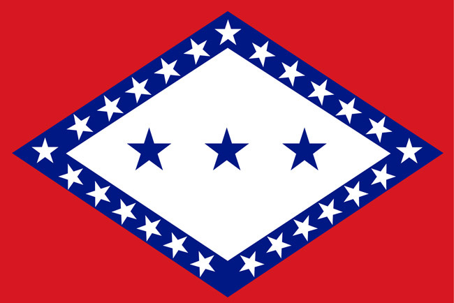
Rank: B-Tier
California
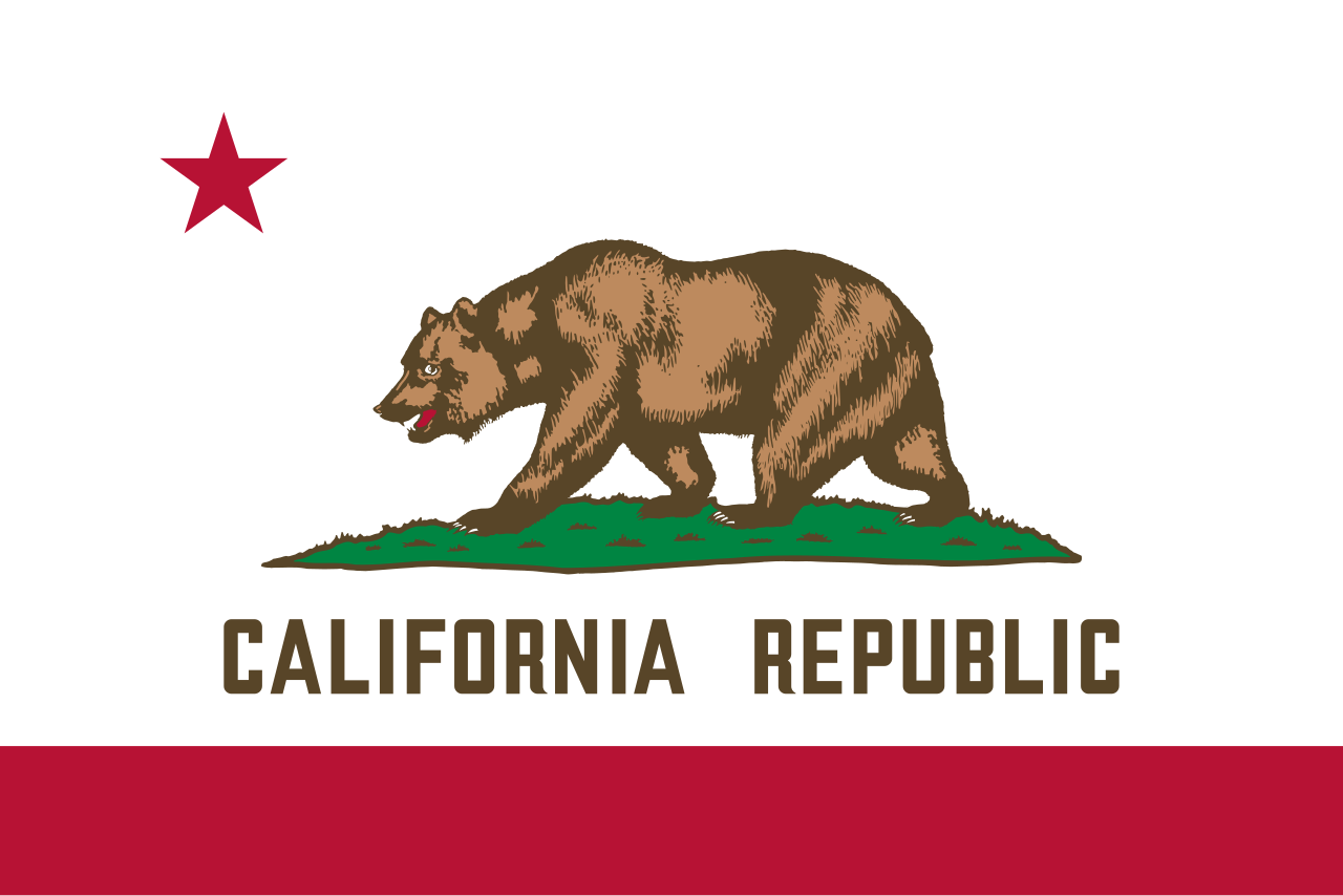
I mean, what else can be said about a flag so well known and frankly beloved as this? I know the 5 principles of good flag design that I hold in such high regard are being blatantly violated here with the complex design and the goddamn name being on it, but I’ll be damned if this isn’t a phenomenal flag. At the end of the day, the 5 rules are merely guidelines, and hey, some rules are meant to be broken. It’s so good, even the survivors of a nuclear apocalypse have their own version. This flag is both amazing and iconic, but in my personal rankings, it’s barely edged out by the top 5 best.
Rank: A-Tier
Colorado

Now here’s a flag that knows good branding. Every douchebag hiker you’ve ever met has something brandished with the Coloradan flag, and for good reason. It’s pleasing to look at, has good color synergy, and it even has a big C for Colorado without being obnoxious and writing out “COLORADO” on it somewhere. This is a great flag, full stop. As an added bonus, it’s already really popular with the people of the Centennial State. Good show, Colorado.
Rank: A-Tier
Connecticut

Ah, our first “seal on a bedsheet” style flag (I’ll call ‘em SOBs for short). You’ll get sick of seeing these real soon, but this is one of the better ones, at least. The three grapevines represent the three colonies (Saybrook, New Haven and Connecticut) which would later merge to become the modern 100 miles of hell between New York and Boston. Why grapes? Well, because rich wine moms have been around since the Nutmeg State was founded, that’s why. Okay, let’s make that the symbol of the state. Fuck the Charter Oak, I guess. I personally believe that this flag is a bit overdesigned, and that’s what drags it down in the rankings. Also, Qui Transtulit Sustinet means “He who is transplanted is sustained,” meaning this hateful flag not only uses gendered language, but also promotes colonialism. Cancelled. This simpler and cleaner design would make for an easy improvement.
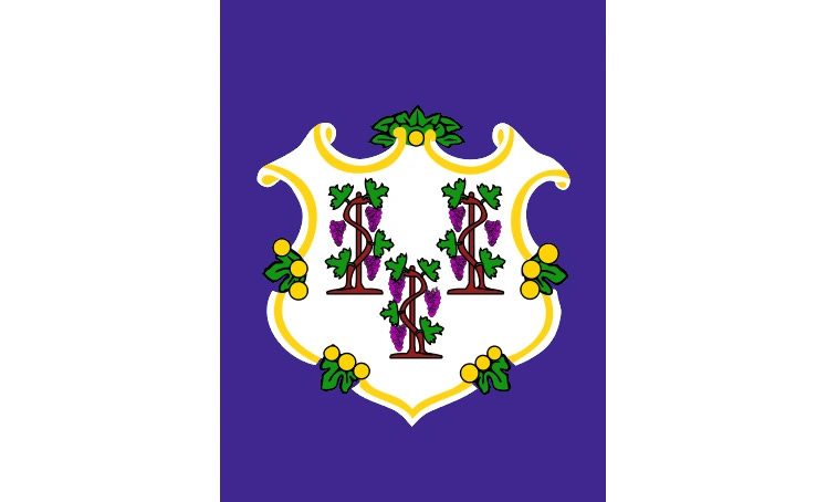
Rank: C-Tier
Delaware
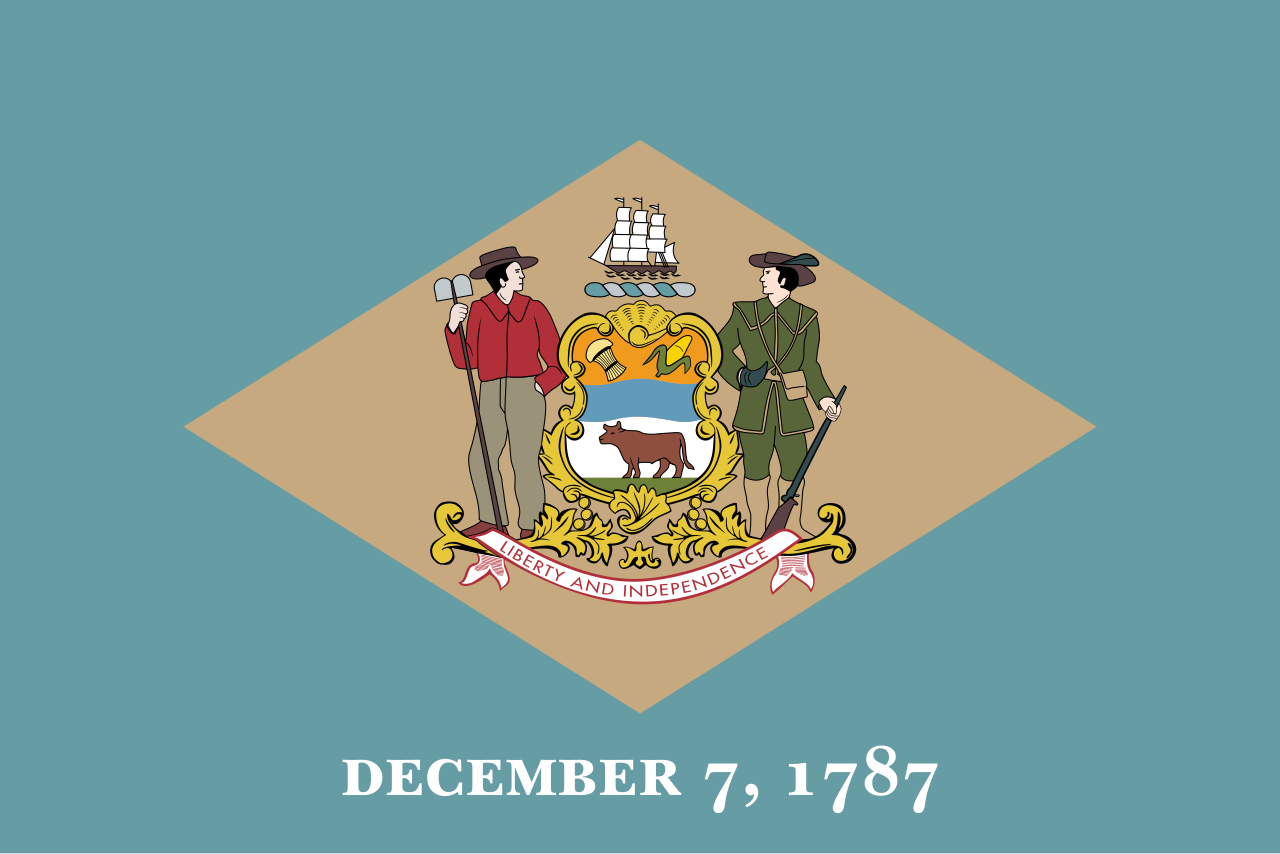
Woof. This is our first really bad flag (there many more to come, I promise), but I suppose Delaware of all states probably deserves to have such a crappy flag. Delaware truly is the insecure 13-year-old girl of states: no one ever thinks about it and its one claim to fame, being the first state, has to be bluntly spelled out to us on their flag. Quite frankly, it’s pathetic, though I do like how the two men (lovers?) stare into each other’s eyes, pondering how their circumstances (or whirlwind romance?) landed them in no one’s favorite state, Delaware. But even if no one loves you Delaware, you still deserve a better flag. I found this charming redesign online, and it manages to keep the themes of the current flag while not being so vomit-inducing. It keeps the colonial blue and buff colors, a nod to General Washington’s uniform, and the singular star represents the first state without being so on the nose about it. The colors of the flag also evoke an Atlantic beach coast, just about the only thing Delaware is known for outside of Old Man Biden.

Rank: F-Tier
Florida

Hey, wait a minute, haven’t we seen this one before? It was the first one on the list, wasn’t it? Oh wait, that was Alabama, and this is Alabama But Worse™. My bad! Though in all fairness to the Sunshine State, I think they have a far more compelling claim to use colonial Spanish iconography than the Alabamians. But Florida is quite possibly our most, er, “special” state, so I think it should have a zany and one-of-a-kind flag to capture the unbridled “Florida Man” energy that America’s drooping cock oozes (poor choice of words, perhaps). To that end, I have designed my own replacement flag. The design invokes both a beautiful Floridian sunset and the glitzy neon of 1980’s Miami, with an alligator, the state reptile, flanked by two palm trees (actually native to here, unlike California) in the center.
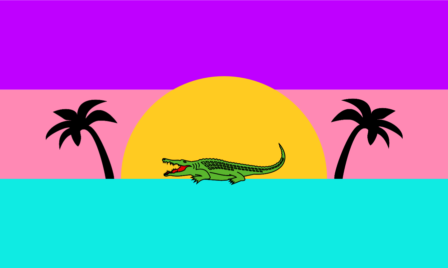
Would this design ever be made official? Probably not because bureaucrats are spineless cowards who hate fun. I suppose for a more serious redesign, the current flag with an orange slice replacing the seal would unironically be an improvement.
Rank: C-Tier
Georgia

Georgia has had, for my money, the worst lineup of state flags over the course of its history. Each one was worse than the last until the current one was finally implemented in 2003. First was a collection of shitty Texas knock-offs, then came a tasteless and blatantly racist Confederate battle flag-adorned one adopted during the Civil Rights movement in 1956. Third was this abomination, a so-called “compromise flag” which is probably the worst flag I have ever laid eyes on. It was an SOB with 5 other flags of Georgia labelled as “Georgia’s History” under the seal. So hideous, this was, that the current flag was adopted a mere two years later to replace it, and it’s better, I guess. Like an ex who can’t stop reminding you about the past, this flag is still based on Confederate iconography, this time literally just being the “Stars and Bars,” the national flag of the CSA, with the state seal in the ring of stars. This redesign I found incorporates a St. George’s Cross while keeping the three pillars of the Georgia state seal and motto. It has four stars as Georgia was the 4th state to join the Union, and it has a nice peach color to help it stick out, and because Georgia is the Peach State, after all.

Rank: C-Tier
Hawaii

The Aloha State truly has one of the most baffling and divisive flags in the country. From what I’ve gathered, people either love it or hate it. I fall more in the latter category. I am appalled at the use of a foreign flag, the British one no less, on an American state flag. But in all fairness, the story behind it is pretty humorous. To start, Hawaii was never a British colony. In the early 1800s, King Kamehameha I of Hawaii was met with a British delegation and took such a liking to the Union Jack that he just kind of stole it for his own use. Chad move. Then, as the story goes, by the time the War of 1812 rolled around, Kamehameha added the 8 stripes (one for each of the main Hawaiian islands) to emulate the American flag to play both sides and maintain good relations with both. While I appreciated the symbolism and history, I still think this thing is a bit of a cluttered mess. I myself am quite partial to the Kanaka Maoli flag which is popular among the Native Hawaiian population, even if its historical claims of being the “first true Hawaiian flag” are almost certainly false. The colors make it stand out from every other American flag, and it feels both tropical and positively Hawaiian with the traditional shield design. From the outside looking in, this flag seems just as controversial as the current one, so I guess this wouldn’t solve anything. Oh well, I still like it better.

Rank: C-Tier
Idaho

Wait, is this the State of Idaho? I couldn’t tell because it was only written twice, not thrice. What am I even looking at here? Lady Justice and some dork Boy Scout in a Fruit of the Loom advertisement? I honestly don’t know how you salvage this. At least the old flag for the city of Pocatello (in this very state!) was so ugly it was funny. This is just mediocre bad, the worst kind. Believe it or not, not many people think about Idaho or its flag on the reg, so finding potential redesigns was bitter work. I would’ve suggested the whole state stealing Pocatello’s new flag they worked so hard on before I found this cool one. It’s got a gem for The Gem State, a super rad elk, and some unique colors that I can only describe as “jaundiced Bulgaria” to help identify the flag while it flies high in the mountainous skies of Idaho.
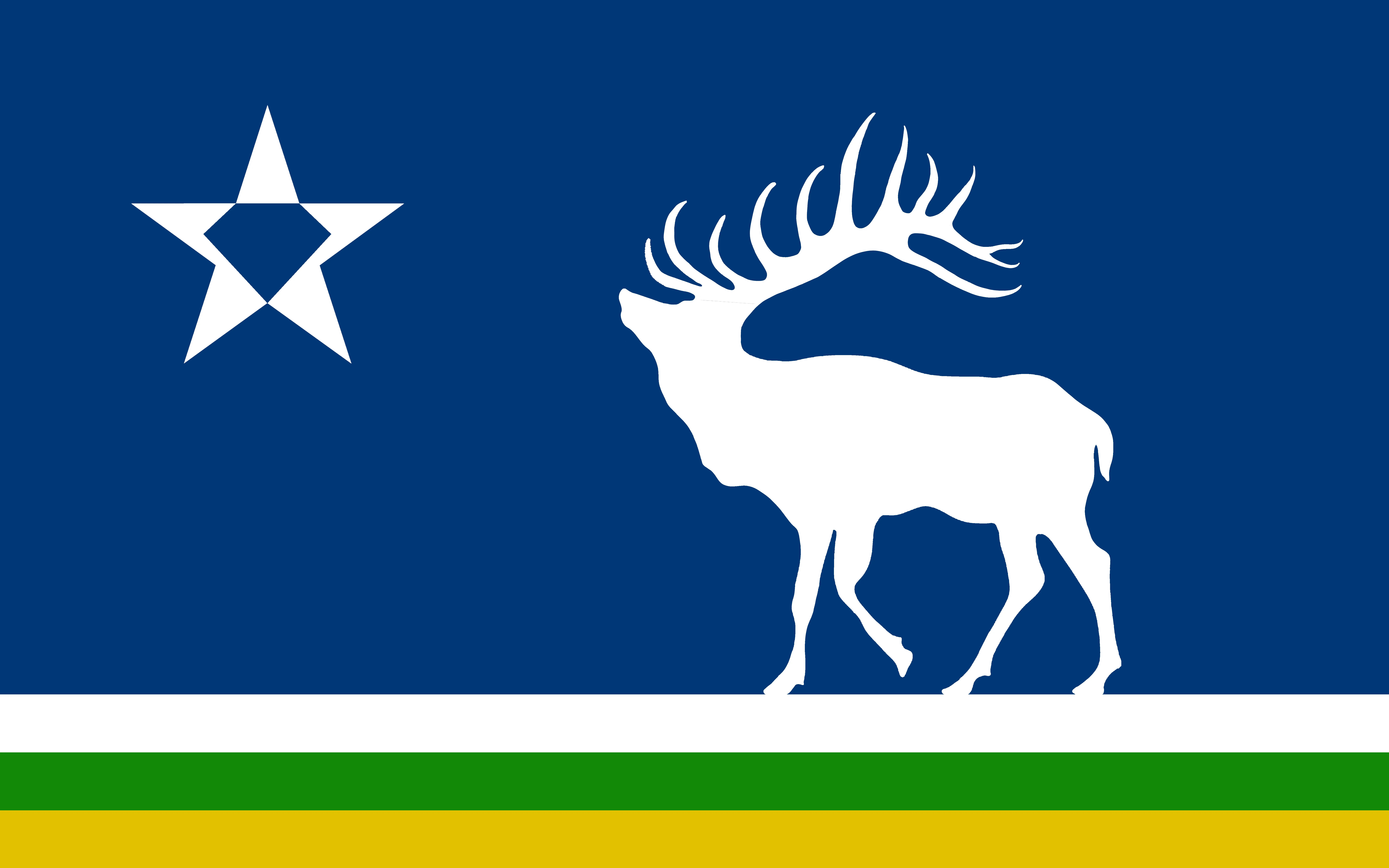
Rank: F-Tier
Illinois

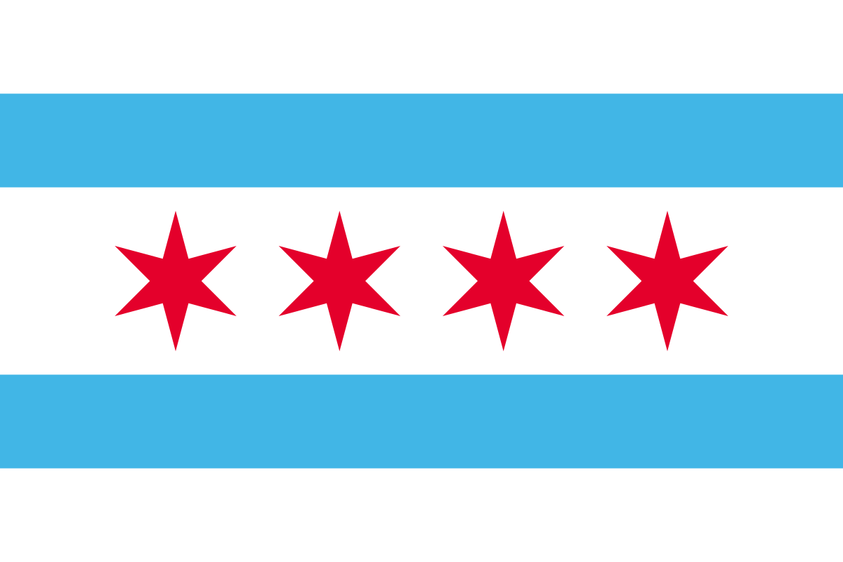
Aww this is cute, but there must’ve been some sort of mistake. It would appear a 3-year-old’s fridge drawing ended up here… oh wait that’s the actual flag. Ummm, points for realism for the text on the sign accurately being upside down for that one segment, I guess? Why is the date of the seal’s design on the flag along with Illinois’ date of statehood? Why does it say “ILLINOIS”? Why is this whole seal just a shite knock off of the Seal of the United States? Why must I look upon this monstrosity? This is bad, like really bad. Chicago has an infinitely cleaner and more beloved flag, so maybe they should embrace the Chiraq tradition of larceny and just steal that? But in what is hopefully good news, there is currently a commission in the state attempting to design a new flag. Let’s hope this actually goes somewhere *cough* Massachusetts *cough.* I personally think the Land of Lincoln should embrace the 16th President and go for something like this fun little number.

Rank: F-Tier
Indiana

Now this is a navy banner done right! The torch of liberty is surrounded by an outer layer of 13 stars for the 13 colonies, followed by a layer of 5 more stars for the 5 states admitted before Indiana, then atop the torch is the biggest star of all, which represents (surprise!) Indiana. And if you weren’t able to follow the logic trail there, they put “INDIANA” right above that star to really hammer the point home. Yeah, I’d get rid of that redundancy, but otherwise, good flag. Nice work, Hoosiers, this flag is the most memorable thing from your state outside of the Indy 500 and Michael Jackson.

Rank: B-Tier
Iowa

Iowa, your flag is a flag of contradictions. It’s an SOB, but the bedsheet is French and not a solid navy backdrop. It has a badass eagle, but it’s carrying an entire college thesis in its beak. It stands out from every other state flag, yet it finds the need to put “IOWA” in big, red letters like a teacher is grading it. I don’t know how to feel. I don’t like the excess of words, the name, or the Frenchy-ness (barf), but I love the aforementioned badass eagle, the historical connections (New France and the Louisiana Purchase), and the unique look. Much like Indiana before it, I would simply remove the name. Does it still have writing on it? Yes, but it feels right for some reason. I think it would be too derivative if it was just the eagle on the chonky French flag, or maybe you can chock it up to the California effect; it simply doesn’t bother me. If you haven’t figured it out yet, the Hawkeye State is far from being the most in dire need of a redesign, but it can still be slightly improved. A good effort, I’d say.

Rank: B-Tier
Kansas

Kansas, what are you doing? The sunflower is your state flower; a symbol of rolling fields and natural beauty that people the nation over associate with your literally flatter-than-a-pancake state. So why, oh why, is sunflower shoved to the top, out of frame, with the freakin’ state seal smacked right dab in the middle and “KANSAS” written below? By putting words on a flag, you’re showing insecurity in your symbolism. Just stick to the sunflower and make a go at a design like the one below. You almost had something Kansas, then you fumbled it harder than your Jayhawks’ 13-year losing streak.

Rank: F-Tier
Kentucky
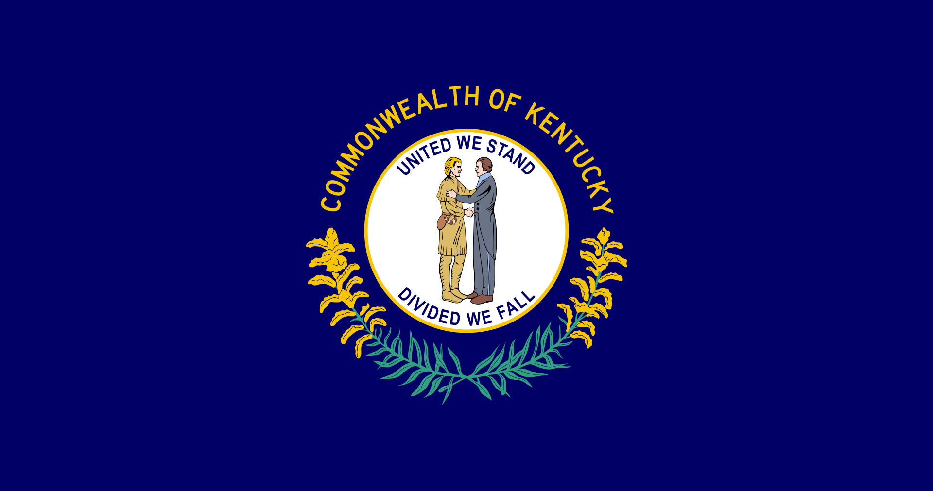
Yeah, yeah, you ain’t fooling me pal. This isn’t the flag of the Commonwealth of Kentucky, despite what it so brazenly says across the top. This is the flag of the Hand Shakin’ Republic. But seriously, what the hell is this? Daniel Boone and Henry Clay going in for a Schwarzenegger-Weathers handshake à la Predator does not a good flag make, my Appalachian associates. Guys, you had horses right there, a heraldic symbol that is time-tested and makes people think of the Bluegrass State before any other. So we’re gonna do it with a horsie and we’re gonna do it right, goddamnit. In my design, we have the horse, a Kentucky thoroughbred, racing across the bluegrass plains under the bright Kentucky sky. In the upper canton sits a ring of 15 stars, as Kentucky was the 15th state, with the same goldenrod laurel below it from the current flag. Perhaps Bond would’ve enjoyed his mint julep just a little bit more if this flag flew over Goldfinger’s stud ranch.

Rank: F-Tier
Louisiana

Fun fact, this is the only U.S. state flag to feature blood on it (sorry Virginia, you’ll have to accept only having murder on yours). The mother pelican is vulning (a heraldic term for wounding) herself to feed her young. This serves as both a symbol of Catholic charity, as well as the Passion of the Christ. Metal. The pelican itself has long been a symbol of Louisiana, so its use here is perfectly sound (even though it’s technically supposed to be a brown pelican, but I digress). Despite this, I think we can make it better. Behold this beautiful and sophisticated redesign: The pelican remains, vulning and all, but this time in the shape of the fleur-de-lis, the symbol of the French monarchy for whom the state is named after, as well as for the rich French-descended Cajun culture the state is famous for. I love this design; it keeps what made the original good and gave it that extra symbolic layer and made the design more digestible. Très magnifique!
Rank: B-Tier
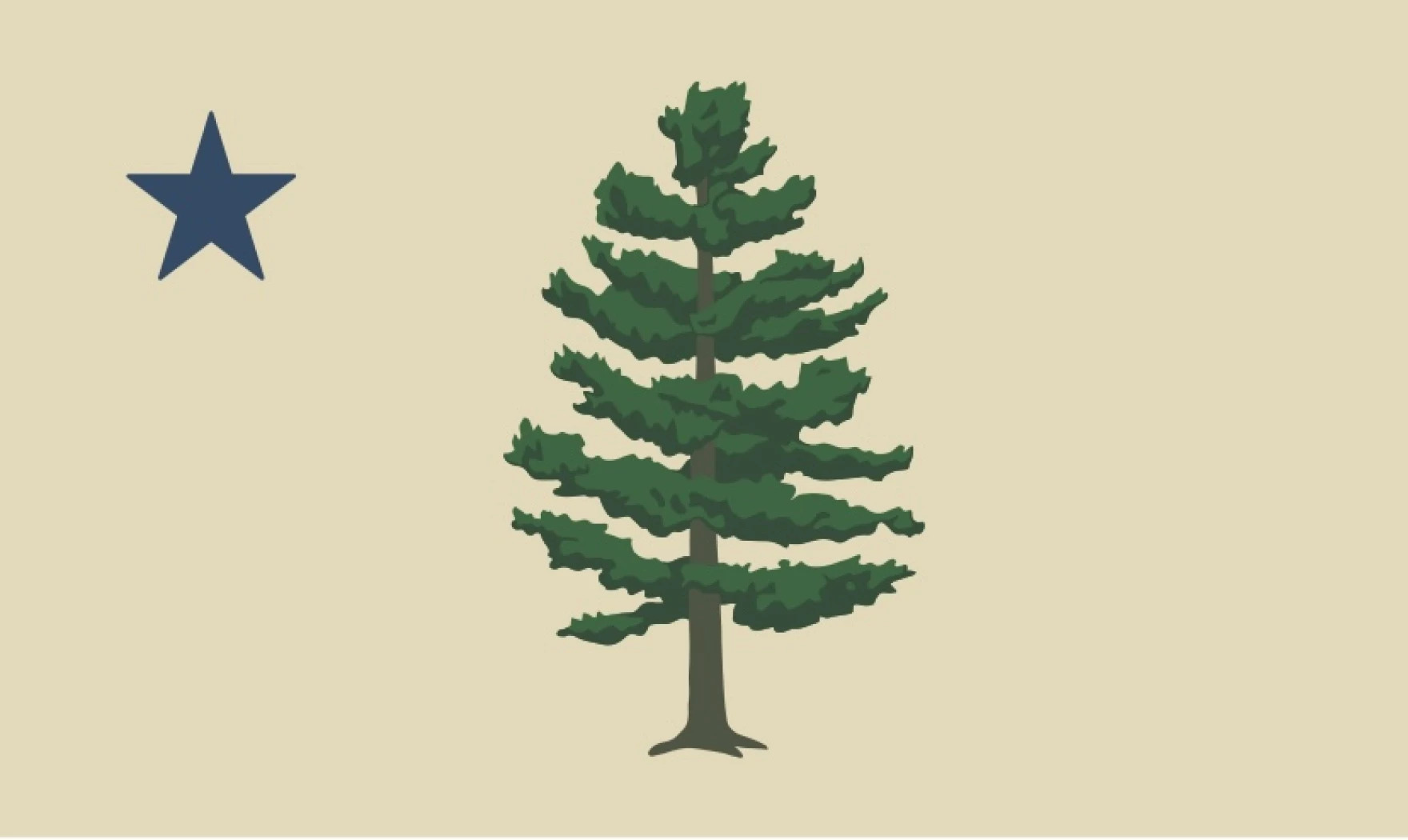
Maine

Of the SOBs, this is among the upper crust, and it’s solely because of the moose. Moose are cool. Thank you for coming to my TED Talk. But we have breaking news folks: the winner of the state’s 2024 flag redesign contest has been chosen for the people of The Pine Tree State to vote on this November! The winner brought an exciting and fresh take; something never seen before in Maine and… wait, it’s just a better looking version of the state’s original flag from 1901? Anticlimactic as that was, this design is still better than the current flag, which makes me wonder why they replaced it to begin with. I think of it as a sleeker version of the current flag: it still has the North Star and the Pine Tree, two important symbols of Maine, and as an added bonus, the tree has 16 branches, one for each county of Maine. It has that rustic and homey feel that the state itself embodies, and I am quite fond of it. Should this become officially adopted by the people, you can expect a full Fun With Flags article on it.
Rank: D-Tier (But hopefully A-Tier soon!)
Maryland

This is the most beautiful abomination I have ever laid eyes upon. I feel like Quasimodo’s mother lovingly looking at her deformed, misshapen offspring. Thank you, Lord Baltimore, for having the most fugly, yet charming coat-of-arms in all of Merry Old England and for making that into the state flag. There is so much going on here; this shouldn’t work, but by golly, I adore this thing (and so do the people of the Old Line State). I will wear with pride a shit with this flag and the phrase “I got crabs in Maryland” emblazoned on it.
Rank: S-Tier
Massachusetts

Oh, look who decided to show up. It’s the ghost of Myles Standish here to remind everyone that despite being a short king, he still defeated the Indians. Very nice Myles, though it remains shocking to me that a flag glorifying the brutal defeat of the natives by the colonists still flies over hyper-progressive Massive Two Shits. You don’t like the flag because you think it is racist, I don’t like it because I think it’s a derivative bedsheet that looks like shit. We are not the same. We had a chance to change it, but after spending millions of taxpayer dollars, the committee gave up and said they couldn’t think of anything better. Our Commonwealth deserves better than a seal on a bedsheet. I’d recommend the unofficial “Flag of New England” that has been around since colonial times to be our new standard, since we basically run the region anyway. Let’s keep Myles’ legacy alive and take what we please!

Rank: D-Tier
Michigan
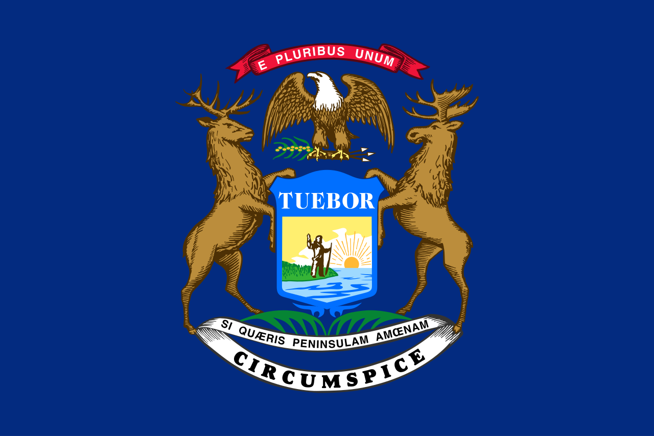
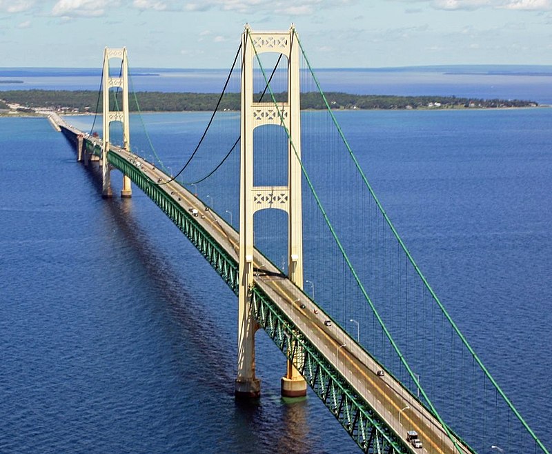
I seek a pleasant pennant, but when I look about me, I find nothing of the sorts. Circumspice? I will, thanks, and hopefully see another, better flag. I like the heraldic styling, but that’s the only good thing about it. Well, that and the goofy-looking moose. To replace this beleaguered bedsheet, I have chosen a redesign that has been dubbed “The Mighty Mac” flag. No, it’s not a new McDonald’s offering, but rather named in honor of the Mackinac Bridge which connects the Mitten to the U.P. The color theory on this simple saltire is surprisingly quite deep. The green represents the two peninsulas, connected by the white bar which is the Mighty Mac itself. The four blue quadrants represent the four Great Lakes that border Michigan (sorry, Ontario). The blue and white together are also a cheeky reference to the bizarre “Water-Winter Wonderland” license plates that are beloved by Michiganders from Detroit to Marquette. Finally, the saltire shape of the cross itself is identical to the shapes seen in the towers of the Mackinac Bridge. Neat!

Rank: D-Tier
Minnesota

Better than that old piece of shit they had, but it could’ve been so much more. Read my full thoughts on what we could’ve had, and what we ended up getting, here.
Rank: B-Tier
Mississippi
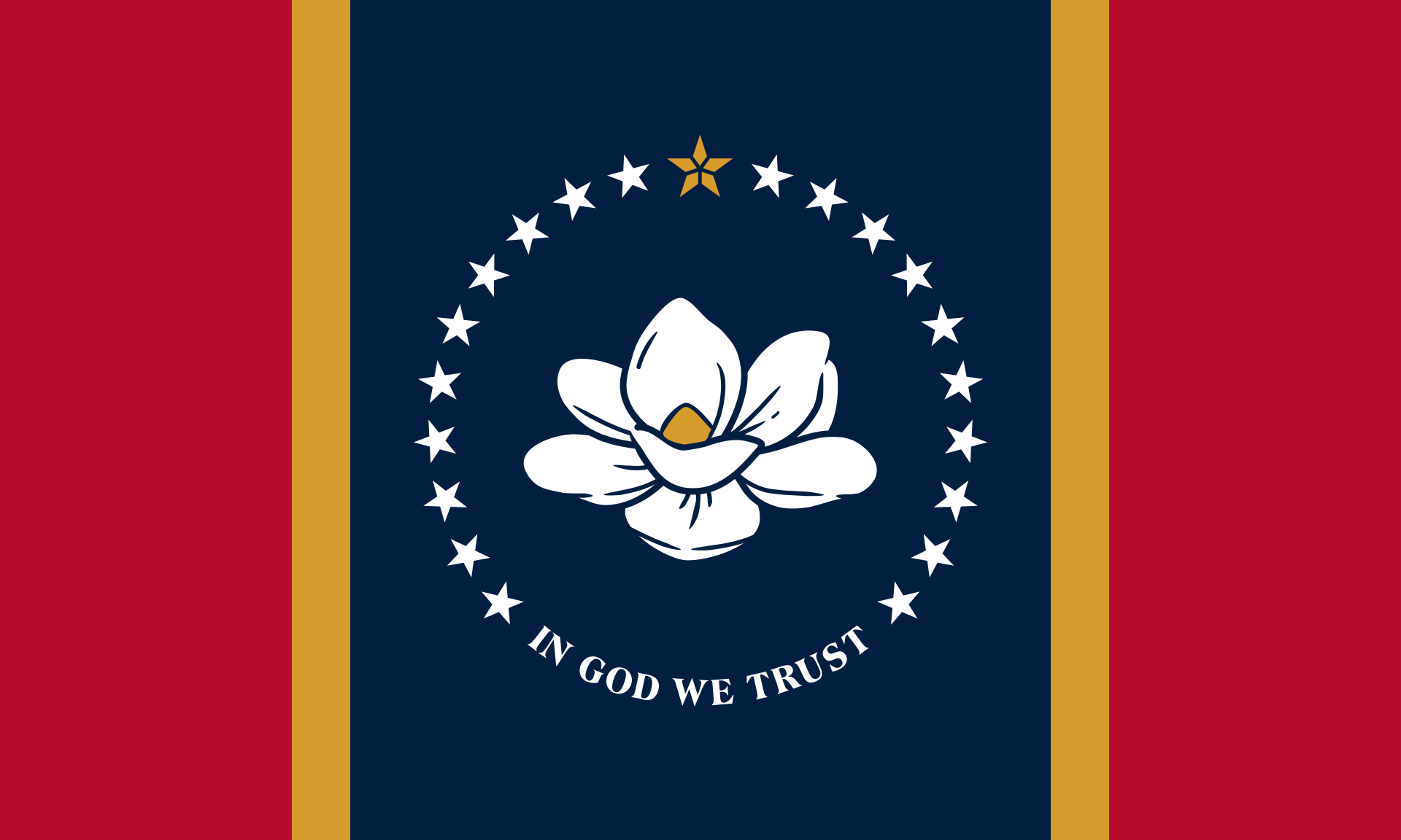
Now here is a truly beautiful banner, miles ahead of the putrid rebel banner that flew over the state until the year of our Lord 2021 (about 25x longer than the Confederacy existed, btw). But now, now we have art. In the center is the magnolia, the state flower of Mississippi, nestled in an obvious symbolic visual of the Mississippi River. Around it is 20 stars; Mississippi was the 20th state, and the one gold star made of diamonds to represent the original Native Americans. Sure it’s a bit complicated, but it’s so visually appealing, and would you look at that, it’s actually related to the country it’s in and not some slaver rebel state that took up arms against us. Wow! Great job, Mississippi; this is a great flag.
Rank: A-Tier
Missouri

This might be the busiest and most densely crammed design on the whole list. In the seal on the middle of the flag, no more than 20% of the available real estate on this banner, we have two seals, 61 stars, and 3 bears. Jesus. If you’re wondering, that’s the most of any of those three elements on any flag, so congratulations, I think? I like the tricolor (though it’s a bit too Dutch for my liking), and I like bears, so that’s always exciting, but I think we all can agree that it’s a bit much, no? When trying to find alternatives, I saw a lot of flags using the Gateway Arch, and while I was drawn to that originally, I came across this simple and thematically similar one that really spoke to me. The colors retain the spirit of the original while cleaning up the clusterfuck in the middle into a singular star. The wavy white bar represents, you guessed it, the Missouri River, and it travels westward across the flag, representing the westward movement of migrants across the state back in the Oregon Trail times. And surprise! it actually does include an allusion to the Gateway Arch with the circle in the middle.
Rank: C-Tier
Montana

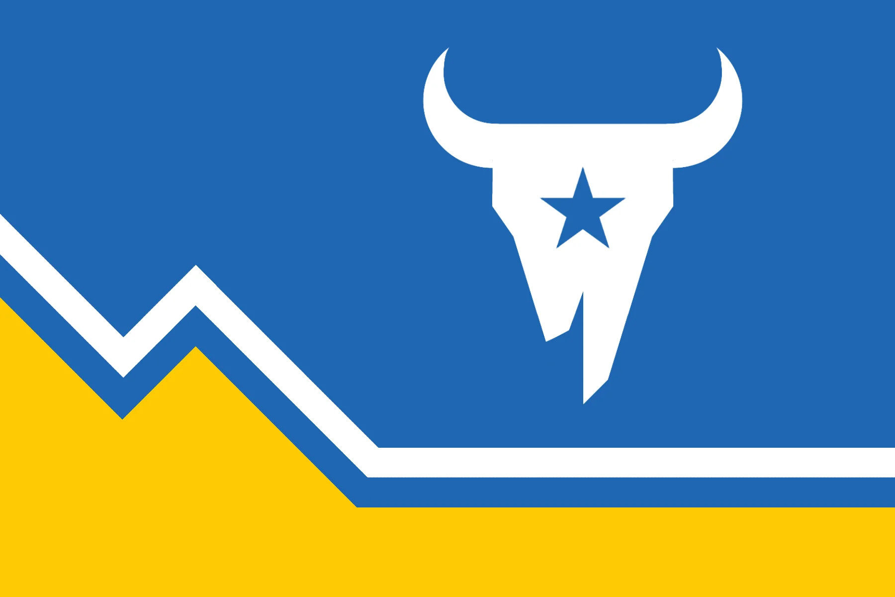
What the fuck is this shit? I actually want to vomit looking at this. Again, the name in big, bold letters is so ugly, and the MS Paint clip art seal is comically bad. Also, what the fuck is up with the kerning on “MONTANA”? The letters aren’t even spaced out equidistantly. It makes your hideous flag even more atrocious to look at. God this might be the worst state flag in the Union. I hate this thing with unbridled passion. This redesign I found online, however, is magnificent. I love how not only the blue part looks like Montana (akin to Minnesota’s new flag), but it also mirrors the topography of the state’s flat plains in the east and mountains in the west. Plus, there’s a cool bison skull. That’s badass, ‘nuff said. This would be an instant S-Tier for me and would be the single greatest jump in quality a state flag could have.
Rank: Super F-Tier
Nebraska
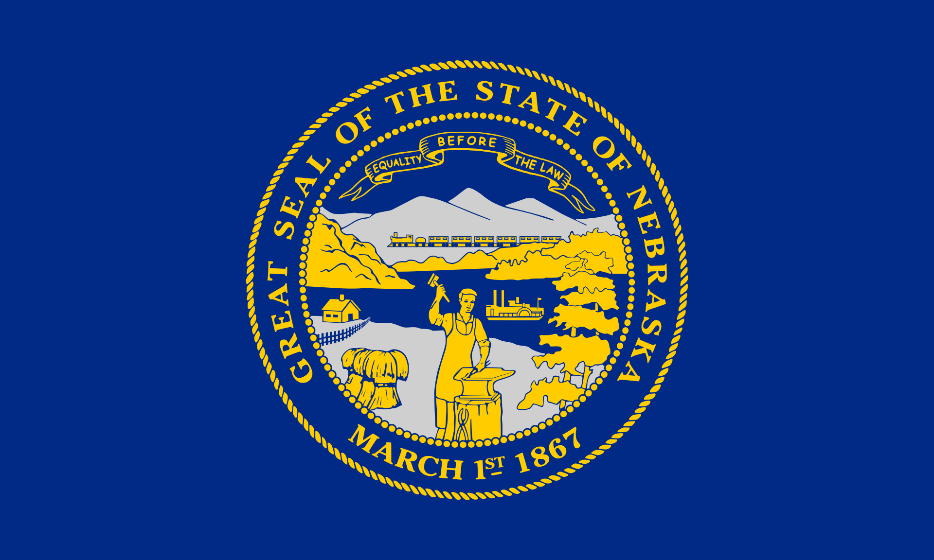
Want to hear a funny story about the derivative, uninspired, waste of space you see before you? This flag is so unimpressive and uninspiring, so forgettable and unloved, that it hung for 10 days outside of the Nebraska State Capital Building upside down without anyone noticing. Oh you heard that right. Ten long days with nary a peep from a concerned Cornhusker. No one gives a rat’s ass about this flag, so let’s dump it into the garbage and start from scratch. And hey, you can’t even argue about “muh history” since Nebraska was the last state to adopt a flag. For the newer, better design, I found a submission for an online flag redesign contest by a Nebraskan native named Jeni Paltiel. This calm and graceful design is meant to evoke the Platte and Missouri Rivers, as captured by the flowing white bar in the middle (in the shape of the Platte, no less). The yellow symbolizes both corn fields and the famous Nebraskan Sand Fields, and the blue is evocative of the wide open skies above the prairies. I really like this design. Often, less is more, and this flag almost makes me want to visit all the scenic nothing in The Cornhusker State.

Rank: F-Tier
Nevada

Nevada, you were handed a golden (or should I say silver?) opportunity to make a really cool flag. You joined the Union halfway through the Civil War, hence the “Battle Born” on the upper left canton. And can I just say, I don’t think a more badass thing has ever been put on a flag (maybe except for Mozambique’s AK-47), but even with that, this flag still blows harder than radioactive fallout from a nuclear bomb test into Las Vegas. I’m not sure what The Silver State should make a new flag look like, but whatever it is, I hope it keeps “Battle Born.” I like this design that goes all-in (pun intended) on the degeneracy and lunacy abundant in that desert.
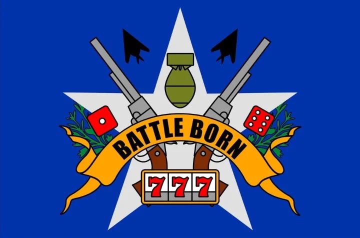
Rank: F-Tier
New Hampshire
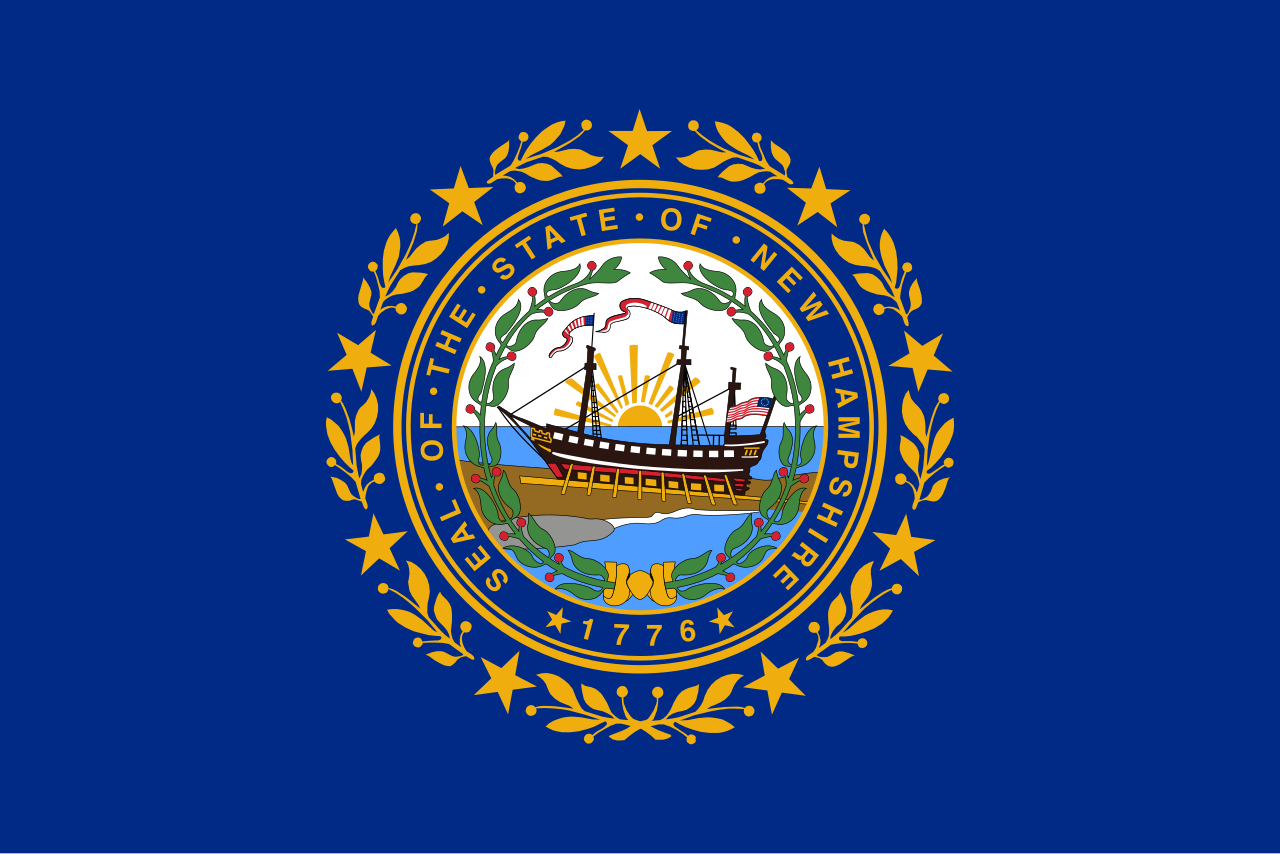
Really went all in on the seal, eh? This is supposed to be a flag, not a painting; let alone a painting of a ship hoisting not one, not two, but three other flags. But then again, New Hampshire is the Florida of New England (that is to say, “special”). The most New Hampshire thing I ever saw was in the town of Freedom, where two adjacent houses were flying the gay pride flag and the Confederate battle flag, respectively. I like the seal as a seal, but as a flag, it’s mid. So what else would I propose? What about just taking the Gadsden Flag as the state banner, given the libertarian propensities of the Granite State? I’ve also seen some really interesting concepts utilizing the Old Man of the Mountain (R.I.P) on a flag. But as it stands now, a bill is making its way through the state house to update the flag and make it stand out more, according to the bill’s author. How will he do this? By adding “Live Free or Die” in Times New Roman font across the bottom of the flag. It’s so tacky, so out of touch with good flag design, but not at all surprising coming outta New Hampshire. But I have included a good redesign proposal which you can read more about here. Long story short, the 9 stars are for New Hampshire’s statehood, the white and black represent both birch trees and granite, and the blue represents the lakes, rivers and pitiful coastline of the state. Very rich in symbolism and very unique.

Also here is this better flag if the New Hampshire State House got their grubby little mitts on it:

Rank: F-Tier
New Jersey
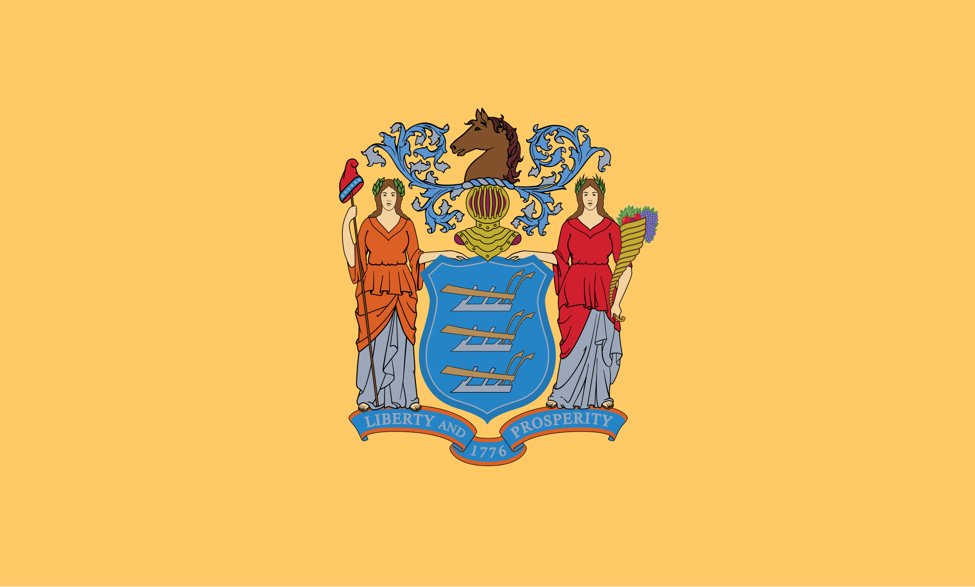
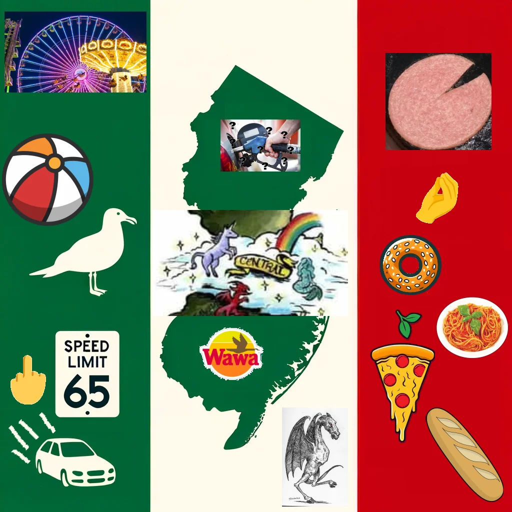
Umm, that color certainly is a choice. Is that a severed horse’s head? What is this, The Godfather? This is ugly as sin, so maybe it does fit New Jersey after all, but we should at least try to do better because this current flag is unsalvageable. I tried my hand at creating a new flag for the Armpit of America, and below is what I came up with. I kept the colors, as they are the ones George Washington assigned to the New Jersey regiments during the Revolutionary War, though I gave more real estate to the more visually appealing Jersey blue instead of the buff of the original. The shape in the middle is meant to evoke the outline of New Jersey, as well. The three stars recall the three plows in the seal, with the green shadowing meant to symbolize the agricultural roots of the Garden State. They also represent the three subdivisions of the state: Industrial Hellscape (North Jersey), Snooki-land (Central Jersey), and Gangs & Gamblers Woods (South Jersey).
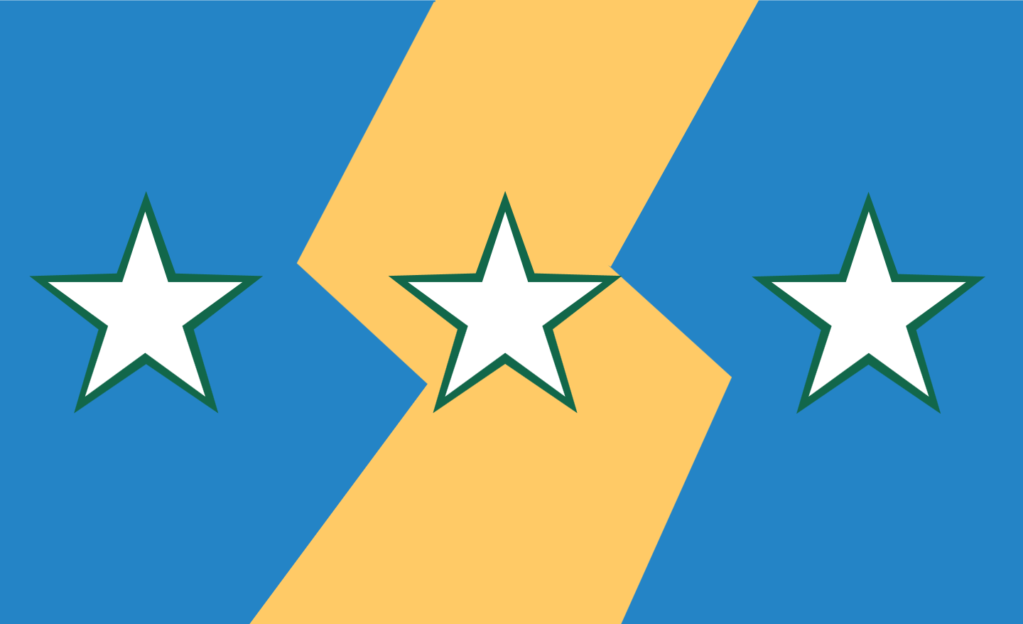
If you think my design is too classy, wasn’t on the nose enough, or think New Jersey deserves only the worst (valid), then here is a design I really fuck with. Honestly, it screams New Jersey more than any redesign I’ve seen, including even my own creation.
Rank: F-Tier
New Mexico
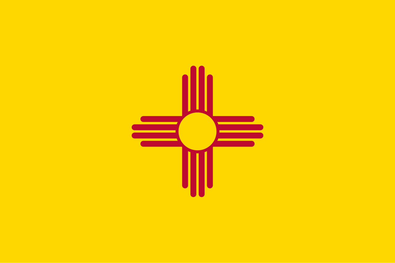
Sometimes, less is more, and that couldn’t be more true than with this beauty right here. The red sun symbol of the Zia people, native to New Mexico, combined with the colors of the Spanish flag, the original European colonizers of the land, gives you the perfect simple and beautiful flag to represent this largely Latino and Native American state. It’s clean, man. Eye-catching and unmistakable, I truly believe that Walter White’s home state epitomizes the zenith of not just state, but general, flag design. Bravo, New Mexico, bravo.
Rank: S-Tier
New York

New York, New York, why does the Empire State, a place so boastful and arrogant, have such a lame-ass flag? Where do I even start? The clay-faced representations of Liberty and Justice are off-putting. The eagle atop the globe gives off the idea of empire, but it’s so crudely drawn that it makes me laugh more than anything. I do love the Teletubbies sun with the creepy face though; it’s the face I make whenever I have to set foot in your wretched metropolis at the mouth of the Hudson. Look, I lived here for a while, so any state graced by my presence deserves much, much better. Here is an alternative design I found: the blue, white and orange recall the Dutch heritage of the state, and the geometric patterns evoke the Hiawatha belts of the Iroquois natives of the region. The white symbolizes the many rivers of the state, particularly the Hudson which flows through the capital of Albany and empties into the New York Harbor, where the Statue of Liberty greets visitors to arguably the most important city in the world. So it’s no coincidence that the Torch of Liberty is placed in the river delta shaped portion of the flag. And before you say this particular iconography is city-centric, 75% of New Yorkers polled want the Statue of Liberty represented on their flag, and the flag should represent the people it waves over.

Rank: F-Tier
North Carolina

North Carolina, did you copy Texas’ homework again? But for real, this is a perfectly average flag, but even then, it’s being carried pretty hard by virtue of copying, oh sorry, “taking inspiration” from another, better flag that has withstood the test of time. It has the dates of two declarations of independence from Britain that are dubiously claimed to be the first real calls for independence in the American colonies. Look, if you want to LARP on your state iconography, then be my guest. I typically can’t stand writing on a flag, but I’ll excuse it this time, as the festoons at least help distinguish it from Texas. The problem with this flag is that it’s both unbelievably mid and a knockoff, so I created this alternative proposal which incorporates UNC Chapel Hill’s Carolina Blue (sorry NC State) and replaces Texas’ lone star with a dogwood, the state flower. Great colors, great symbols, and it has its own identity? Good job, me!

Rank: C-Tier
North Dakota

Okay, even I will admit that the eagle looks badass, but that’s where the good things end with this flag. The tired old navy background, the national motto instead of a state one (New York, is that you?), the vector graphics sun, it’s all so blasé and trite. Fortunately for us, we can find some much better design concepts from the Peace Garden State’s coat of arms which I decided to yoink out and put in my redesign that uses the prairie-esque colors of the aforementioned COA. I based the standard itself on the Nordic Cross, given that nearly the entire state is comprised of German and Scandinavian descended people. The only other sizeable minority, the Native Americans, are represented by the arrowhead from the COA in the cream-colored circle. The arrowhead itself contains a fleur-de-lis, a nod to the original French colonists of the land, and three stars which represent many things. These include the three branches of government, the history of the territory under three flags, and the coats of arms of Meriwether Lewis and Lord Selkirk, head of the first permanent settlement in North Dakota. I also included the festoon from the COA not only because it alludes to the agriculture of the state, but also because it ties everything together like a nice little bow.

Rank: D-Tier
Ohio
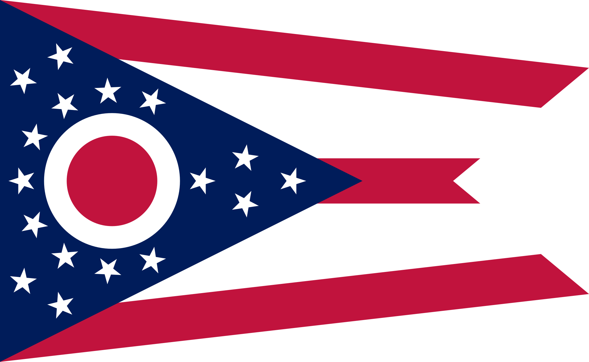
The oft-maligned Ohio of brain rot fame (or perhaps infamy?) has one of the most strange and unique flags in the Union, and I love it. Instead of a traditional rectangular banner, the sigma rizzlers of the land of presidents opted for a burgee (a flag typically seen on boats). This really makes it stick out from the crowd while also remaining uniquely American with red and white stripes and a blue chevron with 17 stars (Ohio was the 17th state) adorning it. Those with a keen eye (or should I say Buckeye?) will notice they also snuck an “O” onto the flag like Colorado did with the C. I gotta give it to this extraordinary flag for carrying so much weight for such an extra ordinary state.
Rank: A-Tier
Oklahoma

Here we have another example of a flag that was perfectly good before it was mucked up by having the state name slapped across it in bold typeface. The name was added to the banner in 1941 as part of an effort to combat widespread illiteracy, and apparently that didn’t help. Welp, you tried. As for a redesign, I would simply revert it back to the original. Contrary to what you may think, this isn’t an SOB. It’s an Osage war shield with two symbols of peace, a calumet (colloquially known as a peace pipe) and an olive branch, to represent the Natives of the former “Indian Territory” and the European settlers, respectively. It’s a good design, but the big, ugly name and generic blue background ultimately drags it down for me.

Rank: B-Tier
Oregon

Oh my eyesore. There is so much wrong with this abomination that I honestly don’t know where to start. Blue and yellow? Daring today, aren’t we? And thank you for spelling out “STATE OF OREGON,” I legitimately wouldn’t have known given how dog water this design is. If you squint reeeeeaaaal closely, you can see what looks like a screenshot of the old Oregon Trail computer game. I have died of dysentery from my eyes absorbing this piece of shit flag. But here’s the real kick in the nuts with this one: Oregon is the only state to have a two-sided flag, and the other side is way better. It’s literally just a beaver, but that is actually something that makes me think of the Pacific Northwest and is unique among all other state flags. So close, yet so far.

Rank: F-Tier
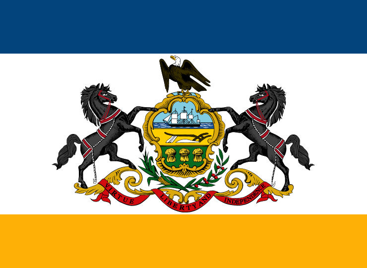
Pennsylvania

Pennsylvania has this aura about it where it almost feels right for it to have a SOB flag like this. That feeling comes from its importance to the founding of our great nation, as well as the old world feel that comes with that. I honestly think it’s pretty decent; the horses and eagle look cool, and I like the color choices. There is a popular redesign heavily incorporating a keystone symbol that has been gaining traction lately, but I honestly think it’s fugly as all hell. I like the premise, I see the vision, and I find it to be very creative, but my gut reaction is negative and frankly, put off, by the color choices. So, I am going with another design that keeps what makes the current flag cool. I originally preferred this simplified flag with the keystone replacing the seal, but I was drawn to this rendition instead. The only real change is the background becoming more reminiscent of The Keystone State’s license plates. The new design keeps the regal and dignified look of the existing flag while also making it stand out from the crowd.
Rank: B-Tier
Rhode Island
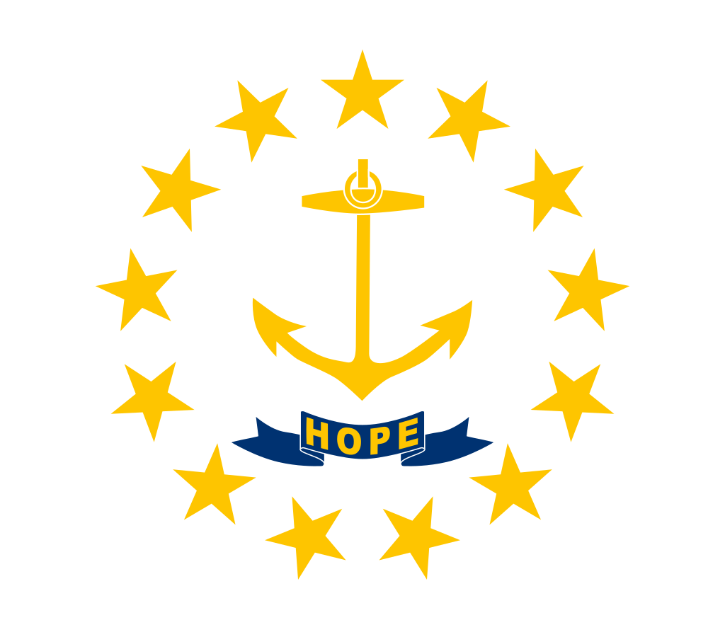
Ah, our cheeky little sidekick, Rhode Island. As a Bay Stater, I look at you the way I would an annoying little brother, but I am not too proud to admit defeat here. Your flag is way, waaaaay better than ours. Uniquely among your peers, you opted for a square flag like the kind seen hoisted on ships (although a rectangular version is flown by your state government, ignoring the state law saying it must be a square). You then doubled down on the nautical imagery by making an anchor the centerpiece and surrounding it with 13 stars as you were the 13th state. Oh, and for some reason you put “Hope” on it, and honestly, that’s what you people need down there, so I suppose it’ll do. Frankly, I love it. I’m proud of you, little Rhode Island. They grow up so fast!
Rank: A-Tier
South Carolina

I’ll get this out of the way now: no, that isn’t a palm tree. It’s a palmetto, the state tree of South Carolina. I really love this flag, though you’d be forgiven for thinking this is the flag of some Islamic emirate with the crescent moon and aforementioned palmetto. It's easygoing, yet rich in history, and the color combination is reminiscent of a beautiful night in coastal Carolina. It carries a simple, yet elegant charm that makes it popular among the denizens of The Palmetto State, and a favorite of mine.
Rank: A-Tier
South Dakota

Oh my. That’s a bold artistic choice, showing the pollution of your land known for its natural beauty on the flag, and within a seal, no less! And may I ask, why does it say South Dakota TWICE? Unbelievable. You failed twice. Good job, South Dakota. And might I say, good job again on killing yet another bill to even consider updating this putrid flag. You suck. So, I have decided to redesign it myself, and as cliché as it might seem, I’m going to double down on the state nickname and the only thing anyone even knows about South Dakota: Mount Rushmore. I mean, you have one of the coolest things ever crafted by human hands within your borders, and you choose to put a fucking smokestack on your flag instead? What kind of sick joke is that? So for my design, I have included Mount Rushmore (no shit) and changed the sky blue to look more, well, sky blue. I did, however, keep the sun, hearkening back to the state’s original nickname: The Sunshine State. Yeah, I know, wishful thinking on their part. I also made the focal point of the flag larger and more easily recognizable from a distance.

Rank: F-Tier
Tennessee

Tennessee has a sneaky good flag that is often overlooked, and I think that’s unfair. It’s a simple and appealing design, with elements reminiscent of Old Glory, tying it back to the mother country. The three stars represent the Three Grand Divisions of Tennessee (East, Middle and West) all bound together in the blue circle representing the state as a whole. I know what you’re thinking: what does the blue bar represent? Now that is the most interesting part, as it is actually a philosophical statement manifest in color. It symbolizes that no matter how hard the people of the Volunteer State try to achieve perfection, they will always fall short of the mark because of the inherent limitations of human pride and ego, our Original Sin if you will, linking again to the state’s Evangelical population and I’m just fucking with you it doesn’t mean anything. It’s just there to break up the crimson and provide a nice contrast when the flag is not billowing. It adds a lot of character, though. I wouldn’t change the flag, but if I had to, I would use this version which is identical in every way, except that it’s orange instead of red, recalling UT’s creamsicle colors.
Rank: A-Tier
Texas

The stars at night are indeed big and bright deep in the heart of Texas, and the Lone Star Flag holds a special spot deep in the hearts of Texans everywhere, being one of the most popular and beloved state flags by its citizenry. For me, this is the crème de la crème of state flag design. It’s easily distinctive as Texas’ flag (and it was for the 10 years of the Republic of Texas), yet it feels like an American state flag because the colors and symbols are so uniquely American. It’s so clean and elegant; I simply adore it. And apparently a couple other states did too, so they ripped it off. Turning it upside down does not make your blatant theft any less noticeable, North Carolina. But seriously, this flag is *mwah chef kiss.*
Rank: S-Tier
Utah

GOATed flag; go read my full thoughts on it here.
Rank: S-Tier
Vermont

Yikes. I know Vermont is a boring state, but this flag is yet another lame SOB. At this point, I don’t think I need to explain why this is so uninspired. Fortunately, there is a very easy fix to massively upgrade this trash. I present to you the Green Mountain Boys flag. The Green Mountain Boys were a militia founded by Ethan Allen (not the furniture store) in 1770 who kept the land of what is now Vermont out of the New York and New Hampshire colonies’ control, maintaining their independence and even establishing the short-lived Vermont Republic before joining the United States. Their flag is iconic and recognizable, historical and beloved; infinitely better than what they got going on now.

Rank: F-Tier
Virginia

Before reevaluating my thoughts on the 50 state flags for this article, I had written off the Old Dominion’s flag as another horrific bedsheet. But upon further examination and contemplation, this positively insane flag has really grown on me. It breaks all the rules of good flag design: writing, a seal, a boring blue background, overdesigned, complicated, and it even has “VIRGINIA” written on it. But holy shit, look at this thing. It’s got nudity, murder, and an explicit call to violence. What else do you want really? It strongly appeals to the lizard-brain parts of me as a man and get my neurons activating. Is it an overplayed SOB? Yes, but it’s the best seal in the country, hands down. That, coupled with the commonwealth’s history as America’s first English colony, gives it, in my eyes, the right to be the only state to use its seal on a blue bedsheet as a flag.
Rank: A-Tier
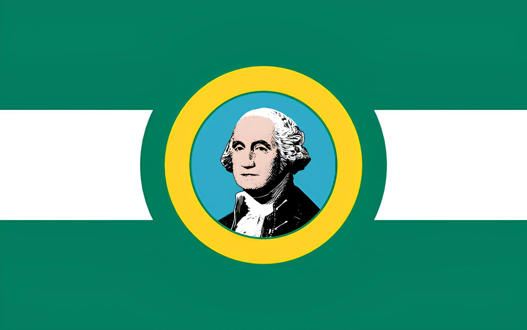
Washington

It would appear that the fine folks in Seattle were too high to realize that they were supposed to make a flag, not a banknote. However, I do like how it sticks out from the crowd by being a nice evergreen (like the state nickname) instead of navy blue. Truthfully, this is one of those flags that finds itself in the overdesigned tier. It doesn’t need the whole damn seal (or the name of the state either, but you’re no doubt tired of hearing me say that). Just keep Georgie on the flag and ditch the words. Bam! Instantly better. Look, D.C. already took the Washington family crest and made a way cooler flag, so you might as well double down on being a mean, green fighting machine and simplify the current flag a bit more to make a perfectly passable pendant.
Rank: C-Tier
West Virginia

West Virginia is one of the most beautiful states I’ve ever had the pleasure of visiting. When John Denver sings of the state being “almost heaven,” trust me when I say you better believe him. I just wish their flag could match the beauty of the Mountain State. As far as SOBs go, this one is definitely in the upper crust. I like the color contrast, the rhododendron flowers, and the historical symbolism, but I want it to be so much more. This overlooked and underappreciated state deserves so much more love, and I think a new flag could help open people’s eyes to one of America’s most forgotten regions. For my design, I used the state’s official colors of old gold and blue, and maintained the rhododendron wreath from the original. Mountain peaks of alternating colors (representing how the state was born during the Civil War) subtly form a “W” and “V” while drawing attention to the focal point of the flag: a crest featuring the black bear, the state animal.

Rank: D-Tier
Wisconsin

Oh Wis-cahn-sin, don’t cha know ya can’t put yer freakin’ name on the flayg? This is one of the ugliest, most putrid abominations ever put to tapestry. This is down there with Montana among the most abominable flags in the country. A cheese-themed flag would’ve unironically been better than this, and 81% of Wisconsinites polled agreed that their flag should be cheesy. I would’ve thought for sure the state animal, the badger, would’ve been the obvious choice, but I guess our silly-sounding friends are so appalled by the obese beaver masquerading as a badger on the current state flag that they have been permenantly turned off of the idea. Fair enough. Well, a flag is supposed to be representative of the people it flies over, so let’s give a Cheesehead-themed flag a go. For my redesign, I went for the style of the Nordic Cross for all the German and Scandinavian-Americans who live there, and I used the colors of the Green Bay Packers, as love for that team is what unites all Wisconsinites. Finally, I added the cheese wedge in the center in the style of the Packers logo because that’s what the people want.
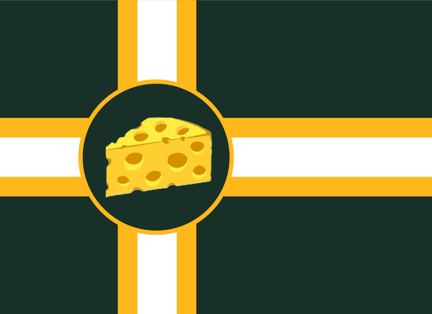
Rank: F-Tier
Wyoming

Wyoming is one of those states where the flag is almost there, but is being held back by one thing. And you guessed it, that one thing is the stupid seal painted like a target on the bison. Someone tell Dick Cheney to stop aiming at the magnificent beast and let it be free. The official story is the seal on the bison also symbolizes branding cattle, but that’s a stretch if I’ve ever heard one. I really wanna like this, I do, but the seal is making me irrationally angry. You had a good thing going for you Wyoming, but no, you just had to blow it up. You and your pride and your ego!
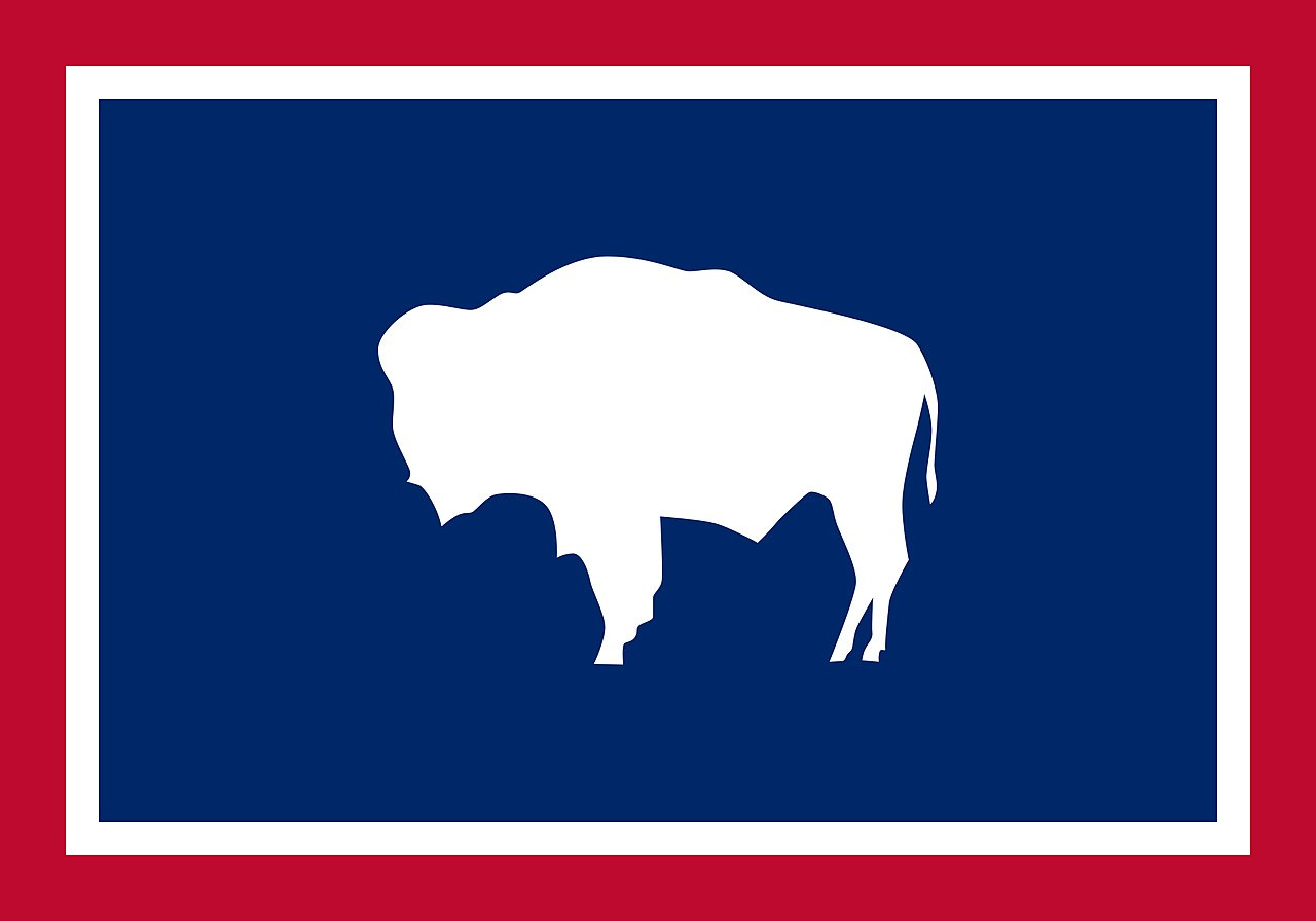
Rank: B-Tier
Final Tier List/Closing Thoughts
Look, if this joyous jaunt through a foray of American flags has taught you anything, let it be this: there is no exact science for a good flag. Flags, like any other form of art, are subject to taste. I like to use NAVA’s 5 Principles of Good Flag Design as guidelines to help create good flags, but they aren’t the end all be all. As I’ve said many times before, great flags can break one or all of these “rules.”
While I find the SOB designs to be visually unappealing, creatively bankrupt, poor visual identifiers in practice, and a time capsule of centuries past when state seals were far more important than they are now, that doesn’t mean you or others may not love them with all your hearts. Hell, even I have a soft spot for some of the bedsheets myself. At the end of the day, the most important factor in determining if a flag is good is if the people it represents believe it to represent them well. So go be the voice for change in state flags from sea to shinging sea. We should be proud of our symbols, not unaware of their existence.
Old Flags Tier List

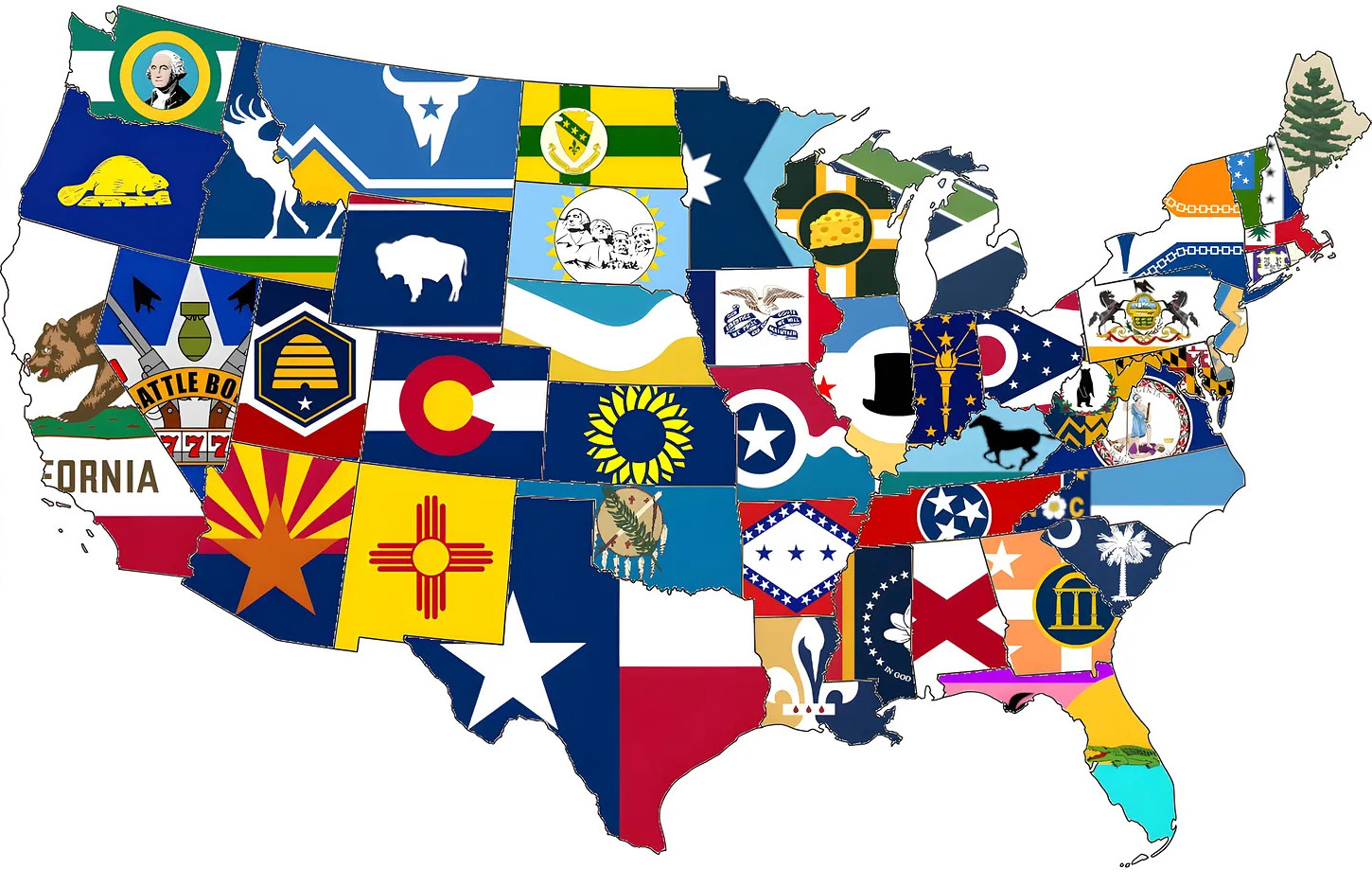
New Flags Tier List and Updated State Flag Map