New Flag Alert
Folks, us flag lovers are truly being spoiled this year. First, Utah changed their seal on a bedsheet, derivative eyesore of a state flag to one of the absolute best in the Union, and now Minnesota has gone and changed theirs too, and in an eight month time frame to boot (what’s taking so friggin’ long, Massachusetts?). But is it any good? Was the old one truly in need of changing? Those are rhetorical questions, of course, I don’t care about your opinion. Mine are the only correct and valid ones.
Straight Outta the 80s
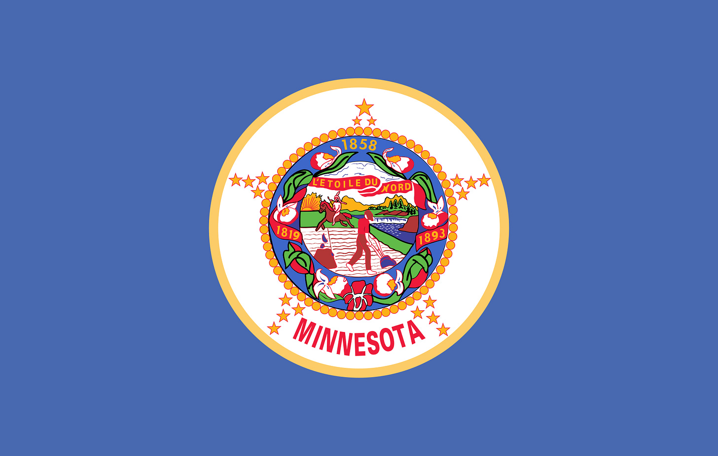
So this here is the flag to be replaced in the North Star State, and wow I can see why. What’s that I hear? Is that the Five Principles of good flag design returning from the heavens to bless us with their divine splendor? Oh I think it is. Let’s run it down:
Keep It Simple: This one’s so simple, even a talented artist with decades of experience and a Masters Degree in Fine Arts could maybe draw it from memory! That was sarcasm for the dim among you. Thank you, I hate it. Grade: F
Use Meaningful Symbolism: Okay, I see the star surrounding the image is evocative of the North Star, the state’s nicknamesake. Of course, if that wasn’t obvious and you also speak that disgusting frog language (French), it also says “The North Star” on the red banner. It is also made up of 19 smaller stars because Minnesota was the 19th state… to be admitted after the original 13, making it the 32nd state. That’s some pretty dodgy reasoning there pal. Oh, and there’s a honky farming while a clip art Indian rides by. Huh? Grade: D+
Use 2 or 3 Basic Colors: There are 8 distinct colors here, including 3 shades of blue and 2 shades of yellow. Not what I meant by 2 or 3 colors, bud. That pastel baby blue background is so 80s, just like when that color was added to the flag; funny that! Vomit inducing and genuinely unappealing to the eye. Grade: F
No Lettering or Seals: Jesus Christ, how many times do I need to teach you this lesson old man? You can’t keep putting the goddamn state seal on a bedsheet! He can’t keep getting away with this! Good luck reading “MINNESOTA” or your slimy French sobriquet when this banner is 50 feet up a pole and drooped like a sad, flaccid willy of a Minnesotan whenever he sees his hideous, rotund wife. Grade: F
Be Distinctive or Be Related: Much like Utah we covered before, it is technically related as it’s one of 30+ “seal on a bedsheet” flags, but that’s like saying technically Bruce Jenner was the one who killed that woman, not Caitlyn. Well technically, this flag is still god awful. Grade: D
Again, I have to stress that a flag doesn’t have to follow all of these rules to be good, but they are very helpful guidelines to making a broadly appealing and meaningful flag design. Regardless, Minnesotans, whether they find the whole thing to be an affront to God like I do, or if they found the very depiction of a Native American on the flag offensive (yes, some people truly believe the state seal is a depiction of white supremacy; you can’t make this shit up), agreed to replace it. Let’s see the top six contenders.
Land of 10,000 Takes
I’m just going to briefly cover the losers and give my thoughts in a lightning round style in order of elimination. They didn’t win, so they don’t get as much love and attention as the victor. As the great Ricky Bobby once said, “If you ain’t first, you’re last.”
First is this piece we’ll call “Atari Flowers.” It was the token diversity hire choice, designed by an Ojibwe woman and representing, umm a lady slipper flower, I think? I mean, if this is the best the Ojibwes could put up, then maybe it was for the best that the white man- wait, hold on, my lawyer has advised me NOT to finish this joke. Anyway, it looks like an Atari 2600 game or some Windows 95 error screen. Jesus, this is just awful. Grade: F
Next is this little number I’ve dubbed “Minnesota, Inc.” because it looks like the logo for a corporation. I like the colors, but this is just a bit too simplistic of a North Star for me. I’m honestly kind of surprised that this one made it this far, but don’t feel too bad that it didn’t win, the guy who designed this also submitted a redesign for the state seal that was ultimately chosen as the winner. Good job Mr. Bruggink, you kind of suck at designing flags but your work on the new seal proved to be pretty loon-crative. Grade: D for the Flag, A for the Seal
Here we have #4, or as it is known “L’etoile du Nord Flag.” Very on the nose with the naming there, Mr. Hundt (the designer of the flag). I’ll call it the “Com-piss Colored Snow Flag,” much funnier, I’d say. Anyhow, it does manage to tick all the boxes of what makes a good flag and it’s honestly not a bad design. The North Star is (if you couldn’t guess by now) the symbol of Minnesota and this design uses that to great effect. The star and snowflake represent the sissy liberals Twin Cities of Minneapolis and St. Paul as the perimeters of the snowflake form the shape of little M’s for Minnesota. Apparently, the artist was also inspired by ugly sweaters. Not sure I would’ve admitted that, but oh well, it didn’t win anyway. While it may tick all the boxes in the Five Principles of good flag design, it’s still missing something to make it stand out, showing that the principles are merely guidelines and not set in stone. This flag is missing something, a little je ne sais quoi, as it were. Grade: C
The bronze medalist already has a name, “Mirror of the Sky,” but I like to call it “Hot Garbage” because that seems to be even more apt of a description. At first glance it seems pretty rad, but the more you look at it, the worse it gets. The river doesn’t look like a river, nor does the aurora look like an aurora. It’s so painfully 2020’s. Many a Minnesotan were seemingly fooled into thinking this was actually good, and they’re still going to sell them anyway, despite losing. On a humorous side note, some of the proceeds of the flag sales will be going to funds to help Native Americans take back control of their “rightful homeland.” If the father and son duo Todd and Peter Pitman who designed this flag care so much about it, then perhaps they should have either A) let a Native design the flag for their homeland or B) lead by example and get their mayo monkey asses off the “stolen land.” Just a thought. At least the colors are nice. Grade: D+
In second place is this delightful number I’ve christened “Silent Night, Holy Night” because I am reminded of Christmas every time I look at it. I’m half expecting the little baby Jesus to be nestled up in a manger below that star. All joking aside, I really like this flag. It was designed by an 83-year-old native son who moved to Texas and was inspired by their incredible flag and status as the Lone Star State to make an ensign that screamed "North Star State,” and by Jove, he succeeded. The distinct, 8-sided North Star floats in a dark blue northern sky atop a rolling evergreen hill caked in a layer of snow. It truly feels like the flag of a frozen wasteland, and that’s Minnesota. Grade: A
Finally, we have the champion, which has been dubbed the “Polaris Tricolor,” and it is incredible. This piece of art was designed by a young lad the same age as I, and he has an eye for design. Many flags have a triangle on the hoist, see Czechia and Jordan for examples, but none have inverted the triangle like this one. It looks really neat and timeless, not to mention that it also looks like the state of Minnesota itself; how freakin’ cool is that? It also features the North Star in all its glory, and its brilliant positioning ensures it will always be at the top of the flag, fluttering or draped. Then you get the tricolor, oh the tricolor, and it has just the right muted colors to feel like it truly belongs in a cold place like Minnesota. The bands represent the snow, the coniferous forests and, of course, the 10,000 lakes. This is perfect. I love it. Grade: A+
I’m so glad they picked this perfect pendant and don’t have any preposterous plans to modify it in any way, right? Right?
And the Winner is…
You maniacs! You blew it up! Ah, damn you! God damn you all to hell! Why? What the fuck is this? It was perfect and you fucked it up! Why did you turn the purposely asymmetrical North Star into some default, clip art-looking kindergartner’s drawing? What happened to the green and white stripes? You cut down the forests and removed the snow to destroy my beloved tricolor and flood the whole goddamn state! It looks more tropical than cold now that you’ve saturated the blues.
This is supposedly a “variant” of the actual winner, but this “variant” is almost a completely different flag. Here, let me try the same thing:
We’ve selected this flag on the left as the winner! However, the Committee™ has decided to revise the design, just a tad, to make it more suitable. We started by getting rid of the stripes and going for a monochromatic look. We don’t want too many colors! Then, we decided we liked the star motif, but changed the size and quantity to make it more appealing and Modern™. Finally, we wanted to change the saturation a bit; it was too dull before. Behold, the new flag variant:


Great! You just turned America into Somalia. That’s not a variant! It’s a completely different design from what you selected, for God’s sake! I did the same changes this committee made, and look at the results. Is it a bit dramatic? Yes, but I really liked the Polaris Tricolor, damnit, and I just don’t understand why they felt the need to muck about with perfection. You wouldn’t paint over the Sistine Chapel, would you? As if I needed even more of a reason to hate bureaucracy. Well, this is what we got. It’s still a lot better than the old flag, but after seeing what we could’ve (and frankly, should’ve) had, I’m left disappointed in this largely bland banner. I still really dig having the shape of Minnesota be present in the flag, however. Grade: C
The Aftermath
Well, despite cocking it up in the eleventh hour, this is still an upgrade, but some didn’t see it that way. Yes, much like in Utah, right-wingers are once again showing their baffling ignorance and utter disregard for good design by clinging to the old flag like a life preserver. Here’s a lightning fast rebuttal of the “ThEy’Re tAkInG aWaY oUr HiStoOrY!!!” arguments: the now old flag was adopted in 1983. My parents are older than that abomination of a flag. I know conservatives like to wax nostalgic for the Reagan era, but come on, that was only 40 years ago; this flag isn’t some hallowed symbol of Minnesota from the 19th century.
But far worse and more numerous than the “loss of history” claims were the absolutely daft, and sometimes racist, opinions spouted by some sad conservative culture warriors online. Here’s a viral Tweet and some of the bonkers-mental responses to it:


Then of course, the original poster tried to attack the young man who designed the flag, insinuating that because he’s some “damn woke, sissy libtard” or whatever, and that he’s obviously a communist subversive who wants to see the Nordic master race state of Minnesota be converted into a Third World ghetto full of Somali Muslims. Yeah, it sounds fucking insane and brain-dead because like most wacko conspiracies founded on ignorance and bigotry, it is.

Look, I can’t stand the lefties who say everything they don’t like is racist, but some of the responses truly have been. These troglodytes don’t do any research, don’t have any comprehension regarding symbolism, and don’t engage in any form of critical thinking. They are self-professed “free thinkers” who sheepishly parrot anything they read online from a guy with a Chad meme as his profile picture. They see one moron’s superficial color connection and go “Must be a commie/Muslim/socialist/liberal/minority plot to destroy our country!” No, shit-for-brains, you just can’t understand the symbolism of the colors, the importance of the North Star, or even recognize the outline of your alleged “beloved state.” Give me a break.
You know what other two flags have superficial similarities? Texas and Chile. And guess what? They have fuck-all to do with each other and all of their similarities are mere coincidence. The colors and stars have different meanings to Chileans and Texans, which is something these pea-brained pissants cannot seem to comprehend. The Chilean one came first, but I’ve yet to hear any faux outrage among the online right about an allegedly Chilean takeover of Texas.


I can’t believe I have to say this again, but stop trying to make the upgrading of flags a left vs. right thing. We should all be able to enjoy appealing and richly symbolic flags that we can be proud of, ones that can unite us all in love of our 50 wonderful states. Most of the state flags in this country need updating, and not because of “muh racism” or because old is bad, but because they’re boring, ugly, and don’t inspire feelings of patriotism or joy. So come on, let’s all join together and enjoy our new flags! Oh who am I kidding, you people suck and it’s gonna remain a political issue. Goddamnit.


