Anyone who knows me can vouch for the fact that I find flags and vexillology to be supremely fascinating and interesting to study. When I see bad flags, I cringe a bit. There are thousands of different flags in this world, from those of nation states, cities, religious organizations, and even schools. Not all are great, some are even downright hideous (I’m looking at you county flags of Liberia and old Pocatello, Idaho flags), but the purpose of flags is consistent across the board: to be a representation of something. This is why flags that are simple and rich in symbolism are the most appealing.
For example, take the flag of Estonia, a favorite of mine, with its horizontal tricolor of blue, black and white; it is already visually appealing on its own, but with the symbolism behind it taken into account, it becomes even more of a thing of beauty. It represents the beautiful scenery of the small Baltic nation: a clear blue sky, a dark black forest, and a layer of snow covering the earth. This is symbolism at its finest when it comes to flag design. We as humans are naturally drawn to this sort of design, and we are naturally opposed to horrifically literal designs such as the aforementioned old flag of Pocatello, which says plainly in a hideous font, “Proud to be Pocatello,” accompanied by a trademark and a literal disclaimer on the flag showing ownership of the design by the Pocatello Chamber of Commerce.
Do you see where I’m going here? Symbolic, relatively simple, and meaningful flag designs are not only the best, but also the most memorable. I’m willing to wager that even those among you who don’t know or care much for flags can immediately picture the flags of Germany, the United Kingdom, Japan, South Africa, Canada, Israel or France. They are all relatively simple and have deep meaning and symbolism. Contrast this with flags that are extremely literal and complicated that lack meaningful symbolism. For example, see nearly every U.S. state flag. Maybe about a dozen of them are memorable and symbolic; most take the “seal on a bed sheet” route of slapping the state seal on a solid (usually blue) banner with the name of the state stretched across it. These flags are hideous, unappealing, and far too literal. The fact of the matter is, if you have to put the name of whatever you’re trying to represent on your flag, you have failed as a designer.
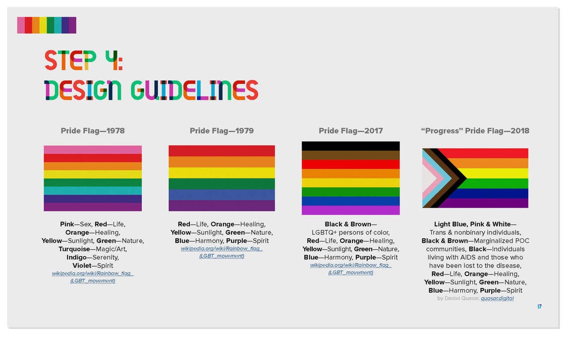
All of this leads me to the brand new, so-called “Pride Progress Flag” I’ve seen popping up all over the place where I live. Now, I’m not the kind of person to try and mandate someone’s life choices and tell them what to like and what not to like, so if you love this flag, then more power to you. But in my opinion, this is one of the worst bastardizations of an excellent pre-existing flag I’ve seen since the Union Jack/Rebel Scum, err I mean, Confederate Flag hybrid. Side note: have you ever seen the statue of Confederate General Nathan Bedford Forrest in Tennessee? That’s the most cursed thing I’ve ever seen, and if we tear down all the Confederate statues, I’m begging that we keep that one just to laugh at it. But I digress. The original rainbow flag, designed by Gilbert Baker, was created in 1978 and is honestly a perfect flag design.
The rainbow flag is brilliant in its simplicity, and rich in its meaning and symbolism. The rainbow symbolizes the diversity of the LGBTQ community, as well as the spectrum of sexuality and gender, according to Mr. Baker. While rainbows obviously don’t contain every single visible color on the color spectrum, the commonly understood symbolism is that the rainbow is a stand-in for all colors. As such, the rainbow symbolizes all LGBTQ individuals, regardless of any external differences. It has become so popular that it is now typically the first image to pop into someone’s head whenever the word “gay” is uttered (see “woke” corporations on June 1st for proof of this). That’s all the hallmarks of not just a good, but a great flag design: memorable, simple, deeply symbolic and meaningful. It is a perfect flag design, through and through.
But all of this is being tarnished by people who are far too literal (and apparently averse to good flag design) with the introduction of Daniel Quasar’s “Pride Progress” flag. This flag not only adds black and brown to symbolize black and brown LGBTQ people (two colors which I might add aren’t in a rainbow), but also light blue, pink and white to represent transgender people (again, none of those colors are in a rainbow either). Of course, Quasar ripped this design from pre-existing flags. The black and brown stripes came from a pre-existing flag made by the city of Philadelphia, which was simply the rainbow with the other two stripes added. The pink, light blue and white come from a pre-existing transgender flag. Of course, unlike the perfectly-designed rainbow flag which was made by Baker to be public domain, Quasar owns all the rights to the “Pride Progress” flag and makes a lot of money off of, and participates in, the same rainbow capitalism they rail against.
The problem with this literal interpretation of flags is the question of where does it end? Even as I write this, a revised version of Quasar’s flag is being made to be more “inclusive” to intersex people. I saw a satirical image of a proposed wholly inclusive pride flag that includes every possible symbol of every possible person and it is as ugly and garish as the likes of poor old Pocatello. We may laugh now, but at the rate things are going, fiction may not be too far from reality. Yes, the “Pride Progress” flag is way too literal, and that makes it ugly. LGBTQ people of every race, creed, ethnicity and age were included in the original rainbow flag; there was no need to specify black and brown stripes. What now about LGBTQ Asians or Native Americans or White people? Will they be getting special stripes too? What about pansexuals and asexuals and every other type of sexuality? Will they get the same treatment as transgenderism by having a special design on the flag? If this literal interpretation is continued, the flag will continue to devolve until it is over-designed, hideous trite so visually unappealing and nauseating that it will be widely despised and rightfully mocked.
Being literal isn’t the only issue with the flag. It’s also a mess of design. The sheer number of thin lines running in different directions is straining on the eyes. The flag of the Czech Republic also has a chevron, but the three simple colors of the flag and the large sections it’s divided into do not make the flag unsightly and hard to follow. The number of colors is too high as well, making it both time consuming and expensive to produce and replicate. Good flags only have around 2-4 colors, although some flags with more colors still look good and are exceptions (see the Seychelles, South Africa and the rainbow flag). There’s just way too much going on already, let alone if more is added to it.
So here’s my proposal as someone who studies flags and loves great flag design: stick to the rainbow flag. It is the perfect flag for the job, and it is truly iconic. It is so rich in symbolism and so well designed. Replacing it would be like taking down the Mona Lisa and putting up in its place the Monkey Jesus restoration.


